Step
02
 cosmin
Member since:
Sep 2010
Now go to Image > Adjustments > Black & white (or press ALT + SHIFT + CTRL + B), use my settings. 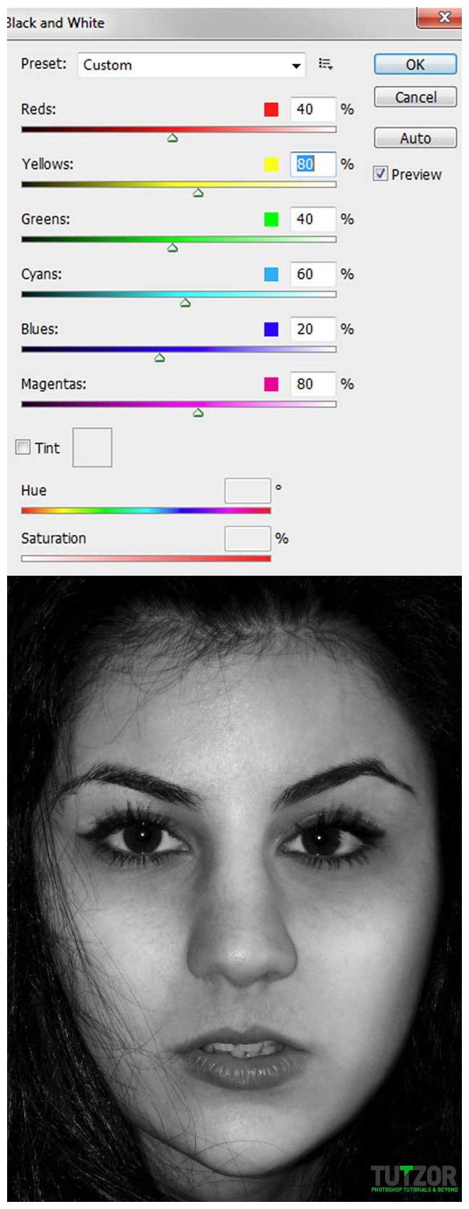
Step
03
cosminMember since:
Sep 2010
Before we posterize the image, pick your burn tool (range: midtones, exposure: 20% ). Carefully burn some areas of the images, around her lips, nose, eyes etc. (I marked some spots), then go to Image > Adjustments > Posterize and set the levels to 4 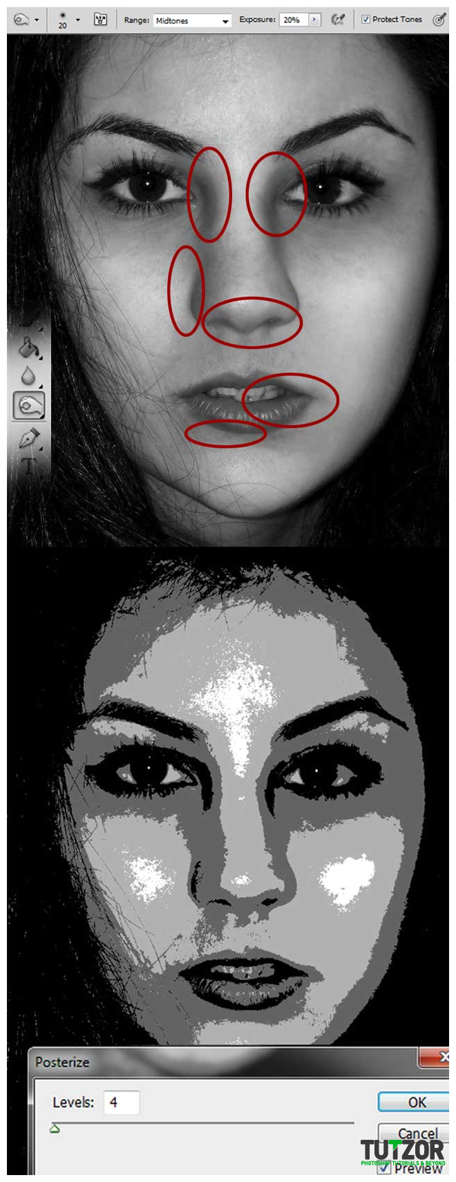
Step
04
cosminMember since:
Sep 2010
Disable the “Portrait” layer for now. Make a new group (call it “words”) and using your favorite font and color ( I used Helvetica and Black) type some words like I did. 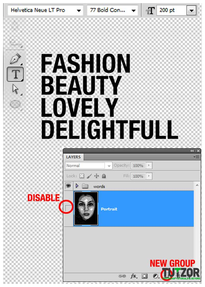
Step
05
cosminMember since:
Sep 2010
Pick the rectangular marquee tool and make a selection like I did. Now go to edit > define brush preset. repeat this step for each word and you will see your brushes in your brush presets. 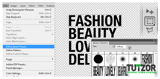
Step
06
cosminMember since:
Sep 2010
We’re going to edit the text sizes a bit but with free transform. Select each word and press CTRL + T (hold Shift so that the proportions will be the same). Now, select the “words” group, make it smaller (CTRL + T) then duplicate the group a couple of times and achieve my result (resize, move, etc.) You can edit each word and in the end try to obtain something like a rectangle. 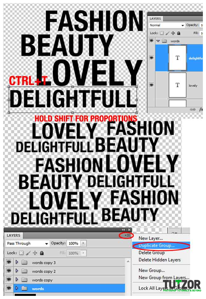
Step
07
cosminMember since:
Sep 2010
Select all the words and make them smaller (CTRL + T) like I did. Now make a selection with the rectangular marquee tool and go to edit > define pattern 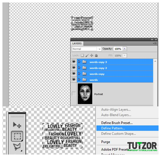
Step
08
cosminMember since:
Sep 2010
Disable the groups of words and make the portrait available again. Using the rectangular marquee tool make a small selection on black, then go to select > similar. 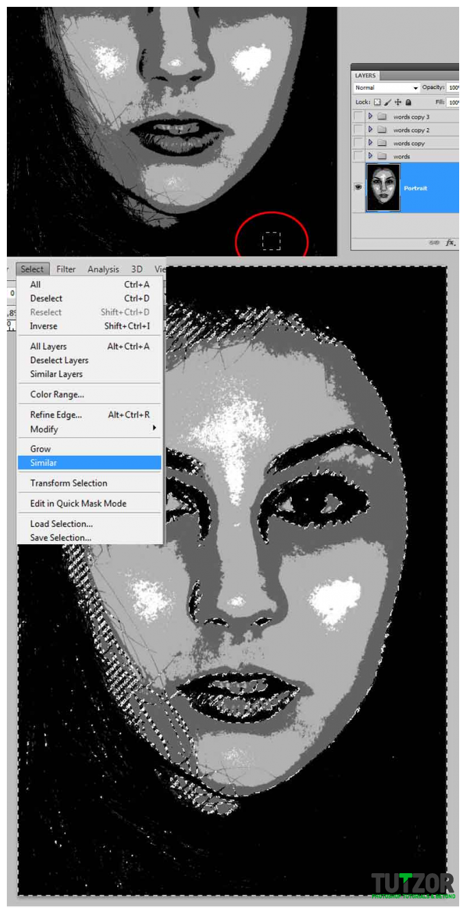
Step
09
cosminMember since:
Sep 2010
Disable the portrait again and make a new layer above CTRL + SHIFT + N (call it “black words”). Using the words brushes with different sizes try to achieve my result or even better. Select the rectangular marquee tool and press the right click over the selection, go to save selection “black selection”. Also, create a new layer (“background”) under the “portrait” one and fill it with white. 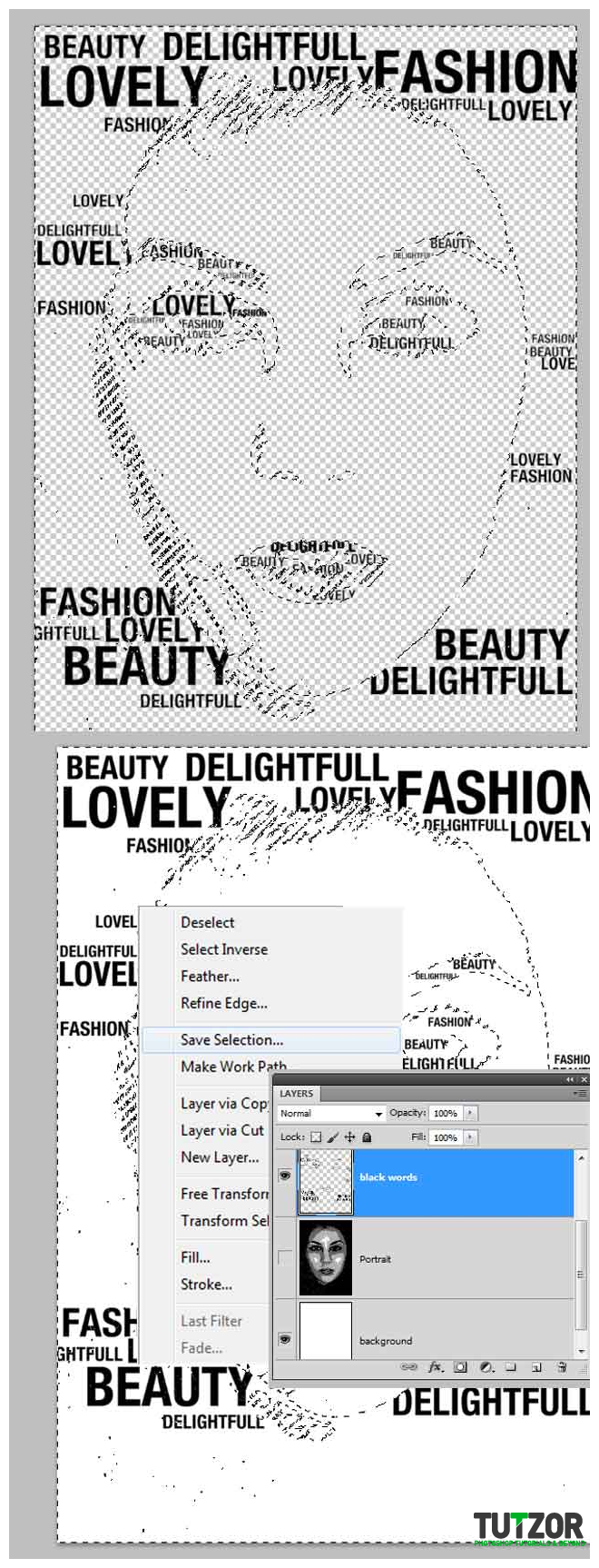
Step
10
cosminMember since:
Sep 2010
If you disabled the selection, load it again (select > load selection > black selection) then add a new layer (“black pattern”). Go to edit fill and use the pattern you just did. Your result should look something like mine. 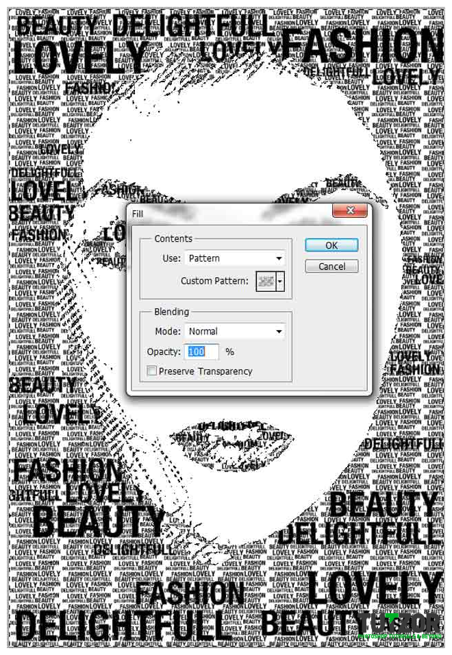
Step
11
cosminMember since:
Sep 2010
We need to make the big words more visible. So, hold CTRL and click the “black words” layer. This will do a selection around the words. Now, go to select > modify > expand by 3px , select the black pattern layer and hit delete. 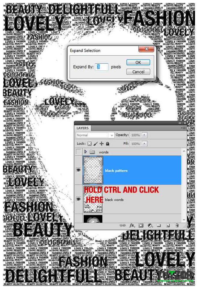
Step
12
cosminMember since:
Sep 2010
Make the portrait available again, and disable the black word and the black pattern. Repeat the steps from above to select the 1st grey. Make a new layer “1st grey words” and disable the portrait again. 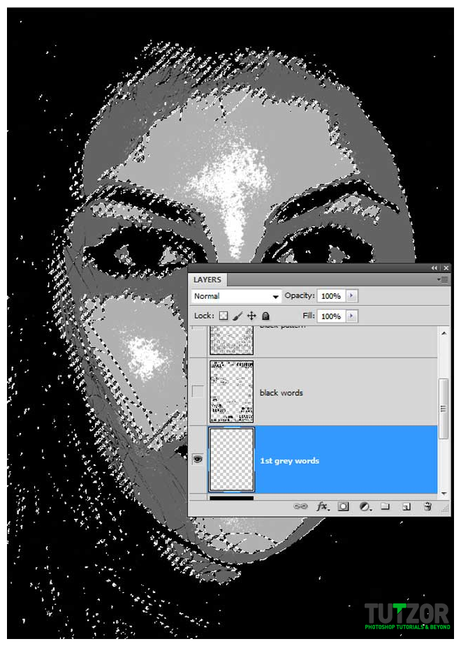
Step
13
cosminMember since:
Sep 2010
Using the brushes and #636363 grey arrange the words then add a new layer called “1st grey pattern” repeat the steps above but this time set the opacity of the pattern fill to 60%. Make a selection again around the grey words (ctrl+ click on the layer > expand by 3px). In the end you should get something like I did. 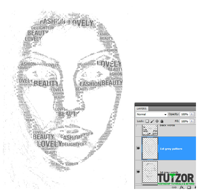
Step
14
cosminMember since:
Sep 2010
Repeat the steps above for the other tone of grey (“2nd grey words”, “2nd grey pattern”) use #C1C1C1 for the brushes and 20% opacity for the pattern. You also can play with the layers opacity, so that the final image will look great. 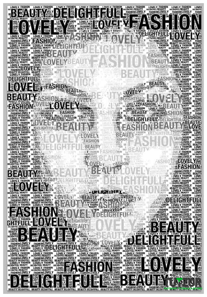
Step
15
cosminMember since:
Sep 2010
This black and white typography portrait works fine for me, but we can add some colors to it. Add a new layer on top and call it “gradient”. using a linear gradient and this colors #5b002f, #a10070, draw like I did. 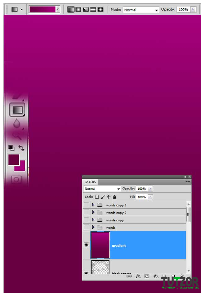
Step
16
cosminMember since:
Sep 2010
Now set the blending mode of the ”gradient” layer to lighten. Your result should look like mine. You can use different colors if you want. 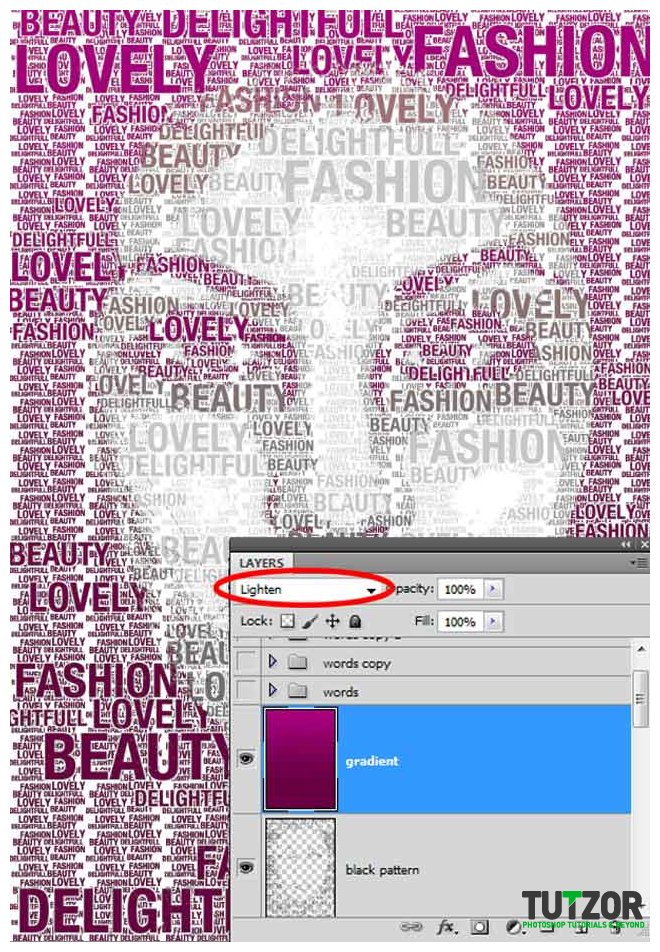
Step
17
cosminMember since:
Sep 2010
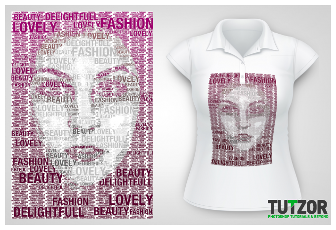
So, if you want to print this typography portrait on your t-shirt or something else, we need to have a transparent background. So if you remember the trick from step 11, but now we need multiple selections that’s why you are going to hold CTRL + SHIFT and click on each layer except the gradient and the background. Now that you have the selection, right click on it and go to “layer via cut”. Call the new layer “color” and delete the gradient and the background layer. Save the file as PNG. 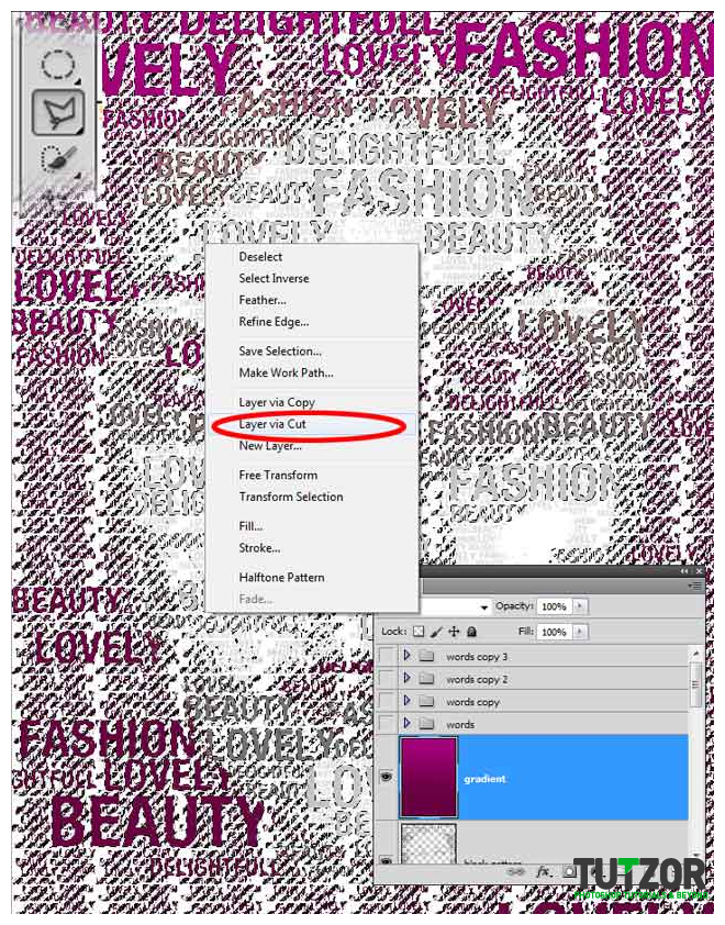
Step
18
cosminMember since:
Sep 2010
You can make also a tshirt simulation. Open the tshirt model from the resources and the final PNG format. Check my simulation and do one better. 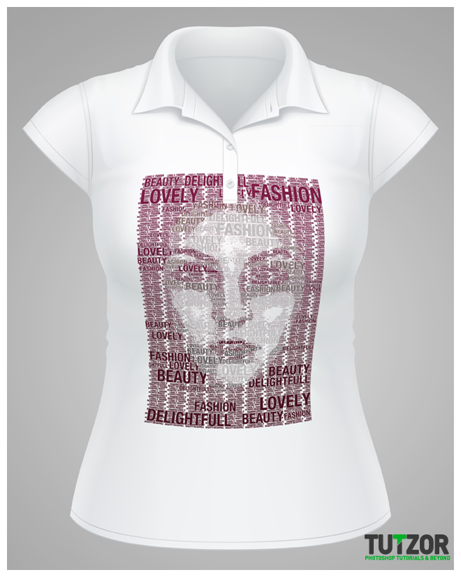
Step
19
cosminMember since:
Sep 2010
That's all, enjoy!